Quick Review: The Phillips Curve
The Phillips Curve is a concept in macroeconomics that describes the inverse relationship between inflation and unemployment. The curve was first observed by the economist A.W. Phillips in the 1950s, and it became a cornerstone of macroeconomic theory. However, the usefulness of the Phillips Curve as a macroeconomic tool has been debated in recent years, particularly by economists who hold different views on macroeconomic theory.
Saltwater macroeconomists, who are typically based at universities on the coasts of the United States, tend to view the Phillips Curve as a useful tool for macroeconomic analysis. They believe that the curve can be used to guide monetary policy decisions, such as setting interest rates, to achieve a balance between inflation and unemployment. Saltwater economists generally follow a Keynesian approach to macroeconomics, which emphasizes the role of government intervention in stabilizing the economy during periods of recession or inflation.
Freshwater macroeconomists, who are typically based at universities in the interior of the United States, take a more skeptical view of the Phillips Curve. They argue that the curve may not hold in the long run, and that there are other factors that affect inflation and unemployment, such as productivity growth and technological change. Freshwater economists generally follow a more conservative approach to macroeconomics, which emphasizes the role of market forces in determining economic outcomes.
One of the key debates between Saltwater and Freshwater economists is whether the Phillips Curve is a reliable guide for monetary policy. In a 2010 article titled "The Phillips Curve is Back? Using Panel Data to Analyze the Relationship between Unemployment and Inflation in an Open Economy," economists Olivier Blanchard and Jordi Galí argued that the Phillips Curve was still a relevant tool for analyzing the relationship between inflation and unemployment. They found that the curve held in several different countries and time periods, and that it could be used to guide monetary policy decisions.
However, a 2018 article by economist John Cochrane titled "A Short Guide to Modern Monetary Theory" questioned the usefulness of the Phillips Curve. Cochrane argued that the curve was based on flawed assumptions about the relationship between inflation and unemployment, and that it could not be used to guide monetary policy decisions. He suggested that policymakers should instead focus on controlling the money supply, which he argued was a more reliable way to control inflation.
Another challenge to the Phillips Curve came in the form of the "flattening" of the curve in the United States in the early 2000s. The flattening of the curve refers to the fact that changes in unemployment were no longer associated with significant changes in inflation. This phenomenon was first noted by economist Alan Greenspan in a 2005 speech, and it has been the subject of much discussion and debate in the years since.
One possible explanation for the flattening of the Phillips Curve is the increased globalization of the economy. In a 2017 article titled "Globalization and Inflation Dynamics: The Impact of Increased Competition," economist Michael B. Devereux argued that increased competition from emerging markets had reduced the pricing power of firms in developed economies. This, in turn, had reduced the ability of firms to pass on increased costs to consumers in the form of higher prices, leading to lower inflation.
Another explanation for the flattening of the Phillips Curve is the impact of technological change on the labor market. In a 2018 article titled "Are Robots Stealing Our Jobs, or Making Them Better? The Impact of Automation on the Labor Market," economist Daron Acemoglu argued that advances in automation had led to a polarization of the labor market, with jobs in the middle of the skill distribution being replaced by machines. This, in turn, had led to a decrease in the bargaining power of workers, which had reduced their ability to demand higher wages
================================================================
Federal Reserve Governor Christopher J. Waller made an interesting speech about the PC and it is worth mentioning some highlights of his presentation
The Phillips curve:
A relationship between price or wage inflation and some measure of economic slack.
Has been the foundation of monetary policy for decades.
A common way to estimate it is to look at output price inflation and the unemployment rate.
One theory, or story, is that as aggregate demand increases, labor demand will increase as well.
As a result, prices of goods and services will rise and firms will hire more workers, as long as there is some stickiness in nominal wages.
Consequently, this story implies that the unemployment rate will fall.
So, there is a negative relationship between price inflation and unemployment.
New Keynesian model:
Another story/theory that monopolistically competitive firms set prices for some period of time.
Firms may have "sticky prices" because of menu costs.
Firms face costs to adjust their prices and so choose to reset their prices only when the benefits outweigh the costs.
Because firms are not identical, only a share of firms adjust their prices each period.
So, when aggregate demand increases, firms with set prices agree to supply the goods demanded at their current prices.
Firms that find it worthwhile to adjust their prices will increase their prices.
As a result, inflation will arise from the firms that adjusted their prices.
Meanwhile, higher employment will come from the sticky price firms, and, implicitly, higher employment goes along with lower unemployment.
Once again, we obtain a negative relationship between output price inflation and unemployment.
The slope of this relationship hinges on the fraction of firms adjusting their prices in response to the aggregate demand shock.
Put another way, the frequency of price changes determines the slope of the Phillips curve.
In both these stories, expectations of future inflation play a critical role:
In the sticky nominal wage story, workers will seek to maintain their real wages by setting their wage demands based on what they think future inflation will be.
In the New Keynesian model, firms set their output prices based on what they think aggregate price inflation will be in the future, and how often and at what pace they expect to change prices.
Regardless of whether you think nominal wages are sticky or output prices are sticky, inflation expectations play a critical role in how unemployment responds to changes in the inflation rate.
This explanation is all about the short run:
In either model, in the long run, nominal rigidities, or stickiness, disappear and expectations of inflation converge to trend inflation.
As a result, in most models of nominal rigidities the long-run Phillips curve is vertical.
What do economic data tell us about this relationship?
We all know that if you simply plot inflation against the unemployment rate over the past 50 years, you get a blob.
There does not appear to be any statistically significant correlation between the two series.
In the 1980s and 1990s, so-called freshwater macroeconomists, who tended to work at universities in the middle of the country, argued the data showed that stories about nominal wage or price stickiness were simply wrong and we should quit talking about Phillips curves of any type.
Diehard believers in the Phillips curve, the saltwater economists working on the East and West coasts, argued that the data blob was the result of unstable inflation expectations.
If inflation expectations were not stable, then the Phillips curve would shift around in such a way that you could not observe the true relationship in the data.
What would cause inflation expectations to be unstable?
Kydland and Prescott (1977) provided an explanation, later popularized by Barro and Gordon (1983), that blamed the central bank.
If the central bank's promises to keep inflation low were not credible, then private agents' inflation expectations would be different than what the central bank promised, which in turn would cause the Phillips curve to shift around.
As a result, the idea that the central bank had to make credible promises to keep inflation low became a bedrock principle of central banking that holds to this day.
Inflation targeting provided a framework for making promises of low inflation credible, and since the late 1990s it has proved to be very successful in practice.
With a central bank strongly committed to inflation targeting, promises to keep inflation at 2 percent are credible in large part because the central bank is observed taking action to keep it near 2 percent, regardless of what is happening to the unemployment rate.
When these promises are credible, the Phillips curve should be relatively flat.
What have we seen in the data?
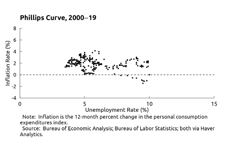
2000-2019 (stable):
The Phillips curve was very flat for the 20-plus years before the pandemic, consistent with the story that the Federal Reserve was credible at keeping inflation low.
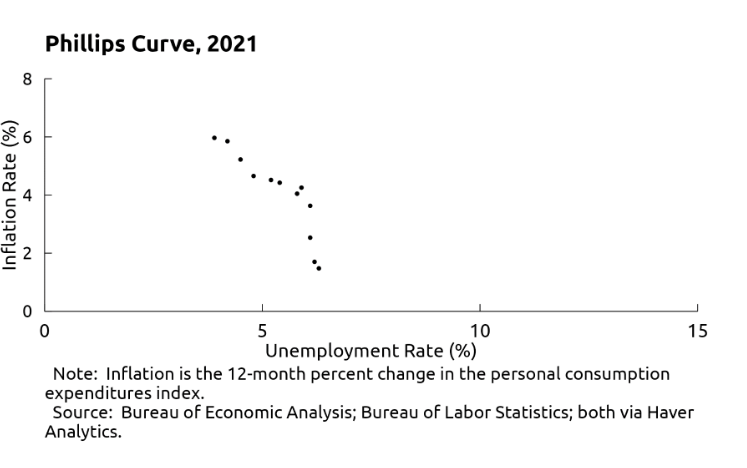
Data for 2021: The Phillips curve suddenly looked relatively steep:
The Phillips curve suddenly looked relatively steep. That is, the labor market became extremely tight as the U.S. economy emerged from pandemic lockdowns.
What Changed? Inflation!
In the spring of 2021, after more than a decade of hibernation, inflation came roaring back to life.
Inflation increased each month of the year and was running at more than double the Fed's 2 percent target throughout the latter half of 2021.
Meanwhile, unemployment fell quite rapidly in 2021, from 6.3 percent at the start of the year to 3.9 percent in December, which was surprising given the long, slow recoveries after recent recessions.
Based on the flatness of the Phillips curve in recent decades, some commentators argued that unemployment would have to rise dramatically to bring inflation back down to 2 percent.
Others argued that, based on analysis of the Beveridge curve, inflation could be brought down without a significant rise in unemployment, although this conjecture was not without controversy.
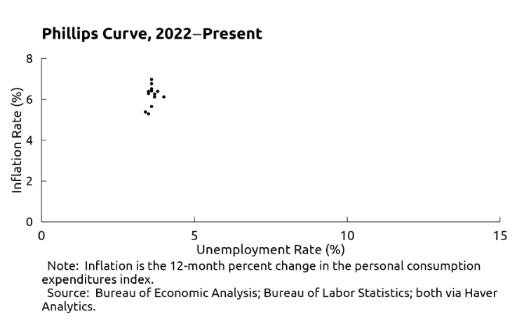
Since January 2022, the Phillips curve is essentially vertical:
The unemployment rate has hovered around 3.6 percent, and inflation has varied from 7 percent (in June) to 5.3 percent (in December).
What happened to the Phillips curve that it is acting so differently now than in the pre-pandemic period? 3 trains of thought:
Freshwater macroeconomists
One theory, or story, is that as aggregate demand increases, labor demand will increase as well.
Another story/theory (New Keynesian) that monopolistically competitive firms set prices for some period of time.
1.Freshwater macroeconomists
Would once again argue that this difference shows the Phillips curve is a statistical anomaly and should not be used as a foundational element guiding monetary policy.
2. As aggregate demand increases, labor demand will increase as well relies on inflation expectations becoming unanchored and causing the short-run Phillips curve to shift around:
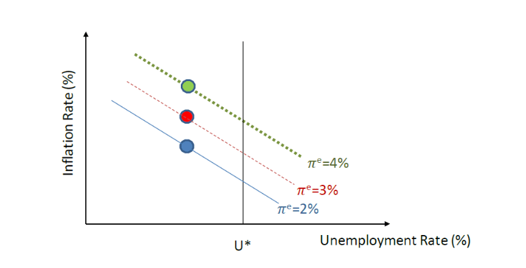
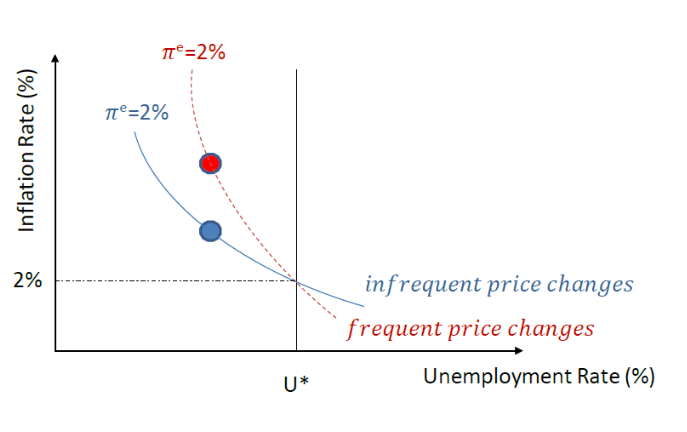
There is a vertical long-run Phillips curve anchored at U*, which is the rate of unemployment that occurs in the absence of price stickiness, and realized inflation is equal to inflation expectations.
And there is a downward sloping short-run Phillips curve that shows a tradeoff between inflation and unemployment due to some nominal price or wage stickiness in the economy.
The short-run Phillips curve assumes a given level of inflation expectations. If inflation expectations increase, the short-run Phillips curve shifts up.
So, if inflation expectations have increased in recent history, we would move from a lower to a higher Phillips curve, as shown by the vertical shift up in the dots.
These shifting dots generate what, on the surface, looks like an essentially vertical Phillips curve, thereby matching the 2022 data.
3. New Keynesian Phillips curve where there is a sudden increase in the frequency of price changes:
The slope of the Phillips curve is determined by the frequency of price changes—the more often prices change, the steeper is the Phillips curve.
An increase in the frequency of price changes steepens the short-run Phillips curve even if inflation expectations are well anchored at 2 percent.
If in recent years the frequency of price changes has increased, we would move from a flatter to a steeper short-run Phillips curve.
On the surface, moving from the blue to red dot, it again looks like an essentially vertical Phillips curve, but just as in the first story, the data are showing us points on different Phillips curves.
What does this suggest about the relationship between inflation and labor market slack and the implications for monetary policy?
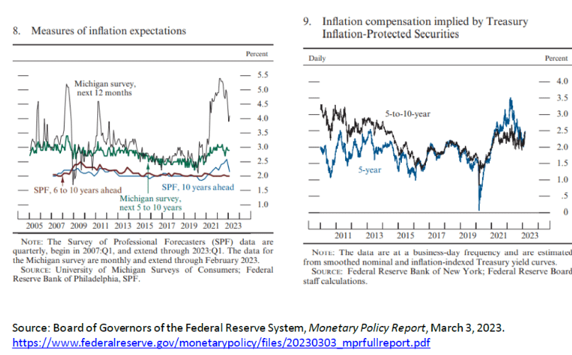
Two charts on inflation expectations from the Federal Reserve's March 2023 Monetary Policy Report.
The charts show that the behavior of inflation expectations depends on the data one uses to measure those expectations.
The left panel reports survey-based measures, while the right panel captures market-based inflation expectations over a variety of time horizons.
On the left, we see that shorter-run inflation expectations followed observed inflation up and down in recent years, with a notable increase in 2021 before reversing course in 2022 and into early 2023.
But inflation expectations over a longer horizon remained within the range of values seen in the years before the pandemic and appear broadly consistent with the FOMC's longer-run 2 percent inflation objective.
Similarly, in the right panel, market-based measures of longer-term inflation compensation are also broadly in line with readings seen in the years before the pandemic.
So, overall, measures of longer-term inflation expectations have remained contained, while shorter-term expectations had moved up in 2021 and have partially reversed their earlier increases.
These data suggest that changes in inflation can be associated with an unanchoring of inflation expectations if we believe price-setting behavior is influenced by changes in shorter-term inflation expectations.
Data on the frequency of output price changes in 2021 and 2022:
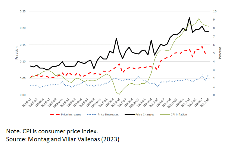
Preliminary work by Montag and Villar Vallenas (2023) uses U.S. Consumer Price Index micro-data to examine about 90,000 individual prices each month and determines if there was a change and, if so, was the change an increase or decrease.
The monthly price change frequency (the black line) increased from about 10 percent of the sample in 2019 to around 20 percent by the end of 2021 and held around that level in 2022.
The increase in price change frequency is primarily driven by firms upwardly adjusting their prices (the red dashed line) during this period.
Furthermore, anecdotal evidence shows that firms were quicker to change prices over 2021-22 than they were in the previous decade.
So, hard and soft data suggest that the frequency of price changes is contributing to what looks like a steep Phillips curve in recent years.
What does this analysis mean for monetary policy makers?
If unanchored inflation expectations were driving what looks like a shifting Phillips curve, this would be extremely problematic for central bankers because it could require dramatic actions by the FOMC to lower inflation expectations to shift the Phillips curve back down.
In current circumstances, one would need to believe it is shorter-term expectations that matter for price setters.
If this belief is true, Waller takes some comfort in the fact that short-term inflation expectations have moved down reasonably fast over the past year.
However, Waller is not sure how much weight to put on this story.
The higher-frequency-of-price-changes story is a more encouraging guide for central bankers.
A steep Phillips curve means inflation can be brought down quickly with relatively little pain in terms of higher unemployment.
Recent data are consistent with this story.
Source: https://www.federalreserve.gov/newsevents/speech/waller20230331a.htm


